Make Your Website Retina Compatible
These days, with devices and screens/displays that have a higher resolution, also known as retina displays it is essential to ensure that your website displays well to retina users so that they don’t see blurry, pixelated graphics.
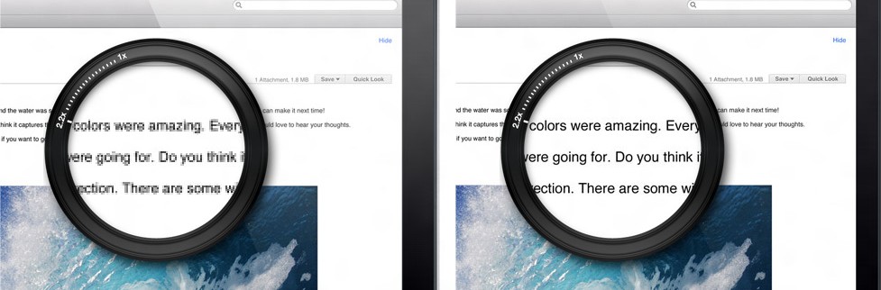
The image above illustrates non-retina versus retina. On the left, you have a non-retina display and on the right, you have a retina display. See how many more pixels there are per area on the right-hand side, giving you much, much more detail. It may not seem like much but when you experience it for yourself, you feel amazed when on a retina display.
What is a retina display?
Retina display is a term which was introduced by Apple to refer to the displays in their devices with a high resolution and pixel density per inch. Compared to predecessors, the retina displays have many more pixels, more than 300 per inch.
How does it affect my site?
In short, your users browsing your website which hasn’t been retina optimized will see pixelated and blurry graphics.
The browser displays less pixels of the graphic per screen pixel, resulting in the graphics to look pixelated.
As shown in the illustration image above, retina users will see a graphic on their screen like non-retina users would, except that it is zoomed into 1.5, 2 or more times. As a result, the pixelation.
Optimizing for Retina
To optimize your website for devices with retina displays is actually quick and easy. There are two main parts to the process:
1. Optimize graphics loaded via IMG tags
You probably have images loading on your site via IMG tag for example:
<img src="https://domain.com/images/logo.jpg" alt="company" />
(https://gist.github.com/tribulant/74e03d23920fc993950a)
When users with retina displays in their devices load this image, it is zoomed to the pixel per browser/CSS pixel their display supports. As a result, it zooms the image, showing less pixels of the actual image per screen pixels.
To fix this, you need to load an image with double the resolution for retina display devices specifically so that when the image is loaded and zoomed, it will display like the original image would to non-retina display devices and give you the amazing detail of a retina display.
So create a copy of the image, giving it exactly double the dimensions. If logo.jpg above were 100px by 100px, you’ll create your retina graphic with dimensions 200px by 200px and name it logo@2x.jpg.
To have the new logo@2x.jpg file load for retina displays, you can use Retina.js which is an amazing script that does the detection and replacement for you automatically so no further work is needed. Just load the retina.js script into your website and ensure that the logo@2x.jpg file exists in the exact same location as logo.jpg
The retina.js script will then – when the DOM is ready – replace logo.jpg with logo@2x.jpg like this:
<img src="https://domain.com/images/logo@2x.jpg" alt="company" />
(https://gist.github.com/tribulant/87cf8177317e9cdf64fa)
If you’re using WordPress, there are plugins which allow you to specify a retina image for each image that you upload to the media library. The retina image is simply an image with double the dimensions/resolution. Such as WP Retina 2X or Simple WP Retina.
That’s it, step 1 done!
2. Optimize graphics loaded through CSS
The CSS part could be a bit more tricky but the most efficient way of doing this would be with a retina CSS media query.
For example, you may have an element in your HTML like this:
<div id="logo"></div>
(https://gist.github.com/tribulant/39ee16951b864915fdb9)
And CSS for it like this:
#logo {

background: transparent url('../images/logo.jpg') center left no-repeat;

display: block;

width: 100px;

height: 100px;

}
(https://gist.github.com/tribulant/38eaba44129c758f7d08)
Again, the logo.jpg would appear pixelated and blurry to retina display devices. So we need the CSS to load logo@2x.jpg to retina display devices automatically. To do this, insert a media query for retina display devices into your stylesheet and inside it, override the background.
@media only screen and (-webkit-min-device-pixel-ratio: 2),

only screen and (min-device-pixel-ratio: 2) {

#logo {

background: transparent url('../images/logo@2x.jpg') center left no-repeat;

background-size: 100px;

}

}
(https://gist.github.com/tribulant/311ad7ca28240e93e35b)
Additionally, notice the CSS background-size since your logo@2x.jpg is 200px by 200px but you still want it to display at 100px width inside of the actual website and not larger.
That’s it, step 2 done!
Enjoy your retina website!
Once you have done those two things, your website should be fully retina compatible. Well done!
I am the owner at Tribulant Software and I have a great passion for WordPress, development, blogging and the Internet in general. Building useful plugins to improve WordPress’ functionality is my goal.
Earn Money by Referring People
Refer customers to us with your affiliate link and earn commission on sales from your link.


If you’re looking for a more light weight Retina plugin, check out https://wordpress.org/plugins/retina-2x/ – it’s much more simple and your website will remain fast!
Thanks for mentioning. That looks like a great plugin, very similar to the WP Retina 2x already mentioned in the article, just much more simple and lightweight.